girafot
girafot
This project created four bold packaging designs inspired by the song "Dafni" by Giraffot, blending hot rod style with the band's raw energy. The result is a tough, eye-catching collection with rugged charm.
Client
girafot band
Year
2023
Category
Marketplace



Research
Research
Our research delved into the events of the 2011 social protests led by Daphne Leef, as well as the ongoing economic challenges in Israel. We examined how these issues are reflected in popular culture, specifically through music, and explored the symbolic elements that could effectively convey our message through design.
Our research delved into the events of the 2011 social protests led by Daphne Leef, as well as the ongoing economic challenges in Israel. We examined how these issues are reflected in popular culture, specifically through music, and explored the symbolic elements that could effectively convey our message through design.
Research
Our research delved into the events of the 2011 social protests led by Daphne Leef, as well as the ongoing economic challenges in Israel. We examined how these issues are reflected in popular culture, specifically through music, and explored the symbolic elements that could effectively convey our message through design.
Design
Design
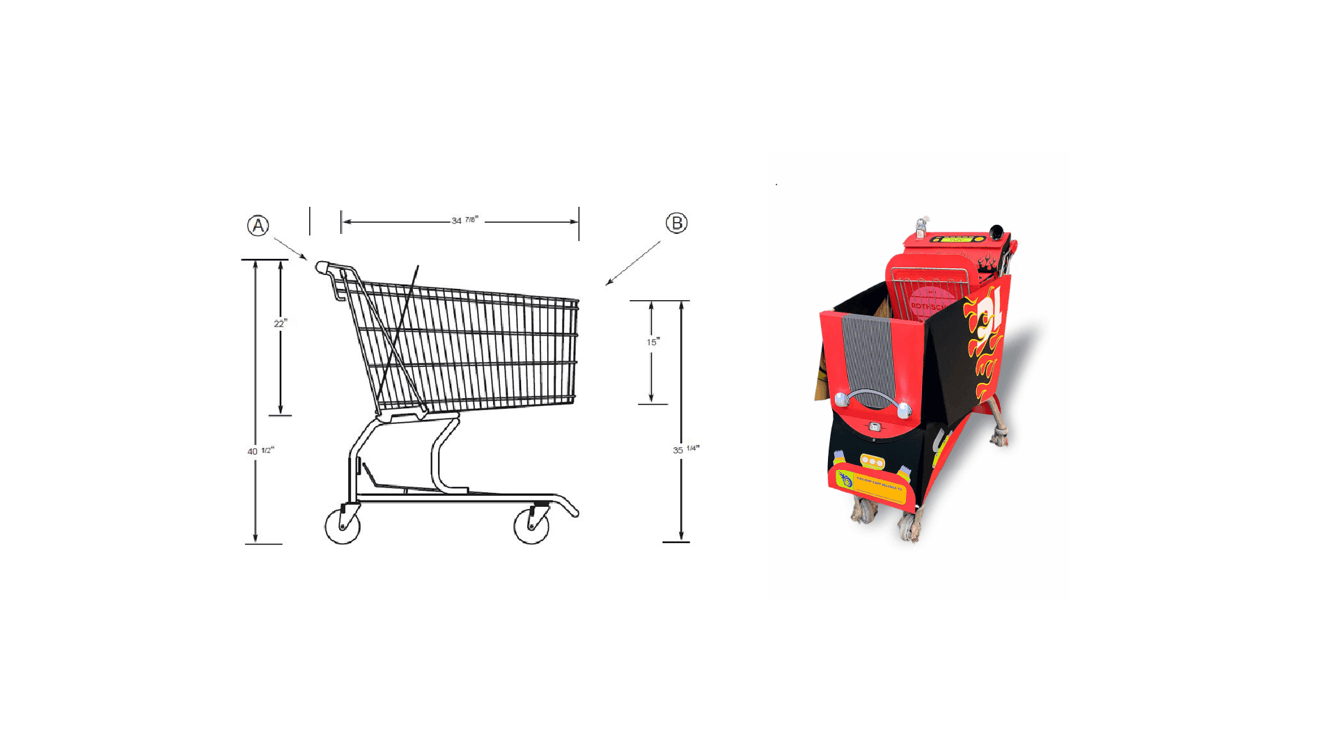
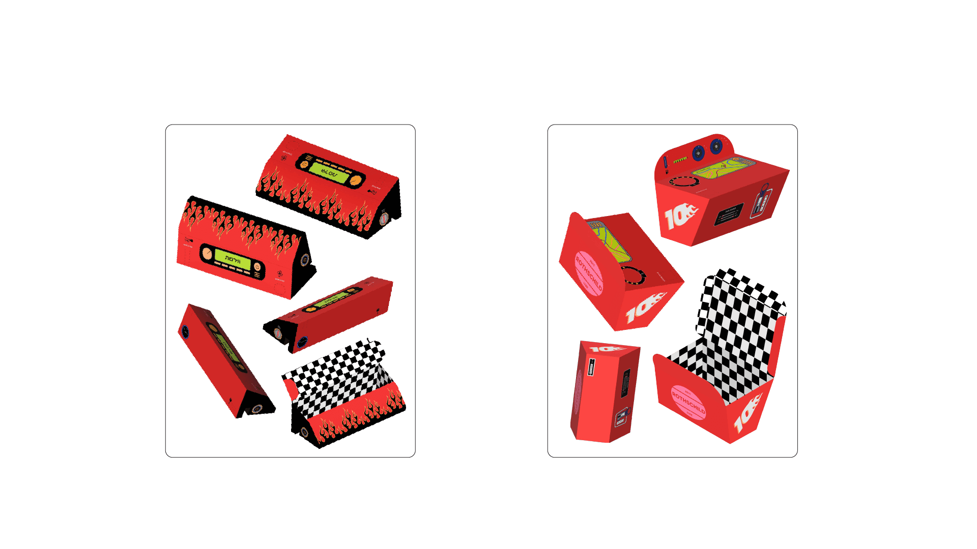
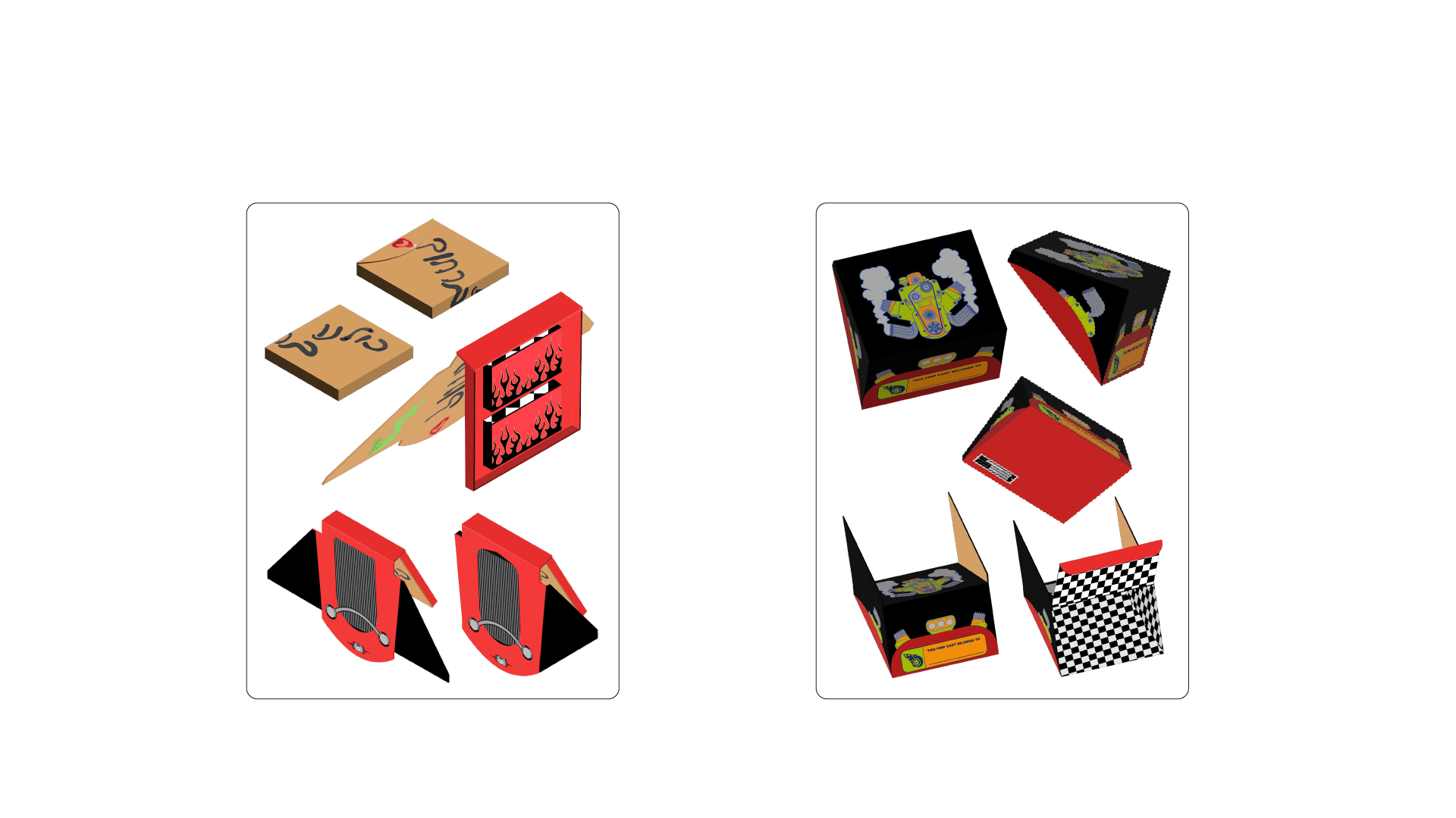
The design was heavily influenced by American "hot rod" aesthetics, serving as a metaphor for the high cost of living in Israel. Each packaging design mimics different parts of a car, incorporating practical elements for street dwellers, while also embedding protest symbols. The overall aesthetic is both functional and a critique of the socio-economic issues in Israel.
The design was heavily influenced by American "hot rod" aesthetics, serving as a metaphor for the high cost of living in Israel. Each packaging design mimics different parts of a car, incorporating practical elements for street dwellers, while also embedding protest symbols. The overall aesthetic is both functional and a critique of the socio-economic issues in Israel.
Design
The design was heavily influenced by American "hot rod" aesthetics, serving as a metaphor for the high cost of living in Israel. Each packaging design mimics different parts of a car, incorporating practical elements for street dwellers, while also embedding protest symbols. The overall aesthetic is both functional and a critique of the socio-economic issues in Israel.
role
role
In this project, my partner Stav and I collaborated closely to bring our vision to life. Stav concentrated on exploring graphic inspirations and developing the initial design concepts, while I led the in-depth research to ensure our work was deeply rooted in the song’s themes. Together, we also focused on typography, carefully selecting styles that enhanced the overall aesthetic. We incorporated numerous easter eggs throughout the design, adding layers of meaning and connection to the song’s narrative. Our combined efforts resulted in a cohesive, visually striking, and engaging final product that captured the rebellious spirit we set out to convey.
In this project, my partner Stav and I collaborated closely to bring our vision to life. Stav concentrated on exploring graphic inspirations and developing the initial design concepts, while I led the in-depth research to ensure our work was deeply rooted in the song’s themes. Together, we also focused on typography, carefully selecting styles that enhanced the overall aesthetic. We incorporated numerous easter eggs throughout the design, adding layers of meaning and connection to the song’s narrative. Our combined efforts resulted in a cohesive, visually striking, and engaging final product that captured the rebellious spirit we set out to convey.
role
In this project, my partner Stav and I collaborated closely to bring our vision to life. Stav concentrated on exploring graphic inspirations and developing the initial design concepts, while I led the in-depth research to ensure our work was deeply rooted in the song’s themes. Together, we also focused on typography, carefully selecting styles that enhanced the overall aesthetic. We incorporated numerous easter eggs throughout the design, adding layers of meaning and connection to the song’s narrative. Our combined efforts resulted in a cohesive, visually striking, and engaging final product that captured the rebellious spirit we set out to convey.


Concept
Concept
The concept combines functionality with social commentary, suggesting that if people are driven to the streets by economic pressures, they might as well do so with style and resilience. The packaging designs not only serve a practical purpose but also symbolize defiance and creativity in the face of adversity, tying together the past protests of 2011 with the ongoing struggles of today.
The concept combines functionality with social commentary, suggesting that if people are driven to the streets by economic pressures, they might as well do so with style and resilience. The packaging designs not only serve a practical purpose but also symbolize defiance and creativity in the face of adversity, tying together the past protests of 2011 with the ongoing struggles of today.
Concept
The concept combines functionality with social commentary, suggesting that if people are driven to the streets by economic pressures, they might as well do so with style and resilience. The packaging designs not only serve a practical purpose but also symbolize defiance and creativity in the face of adversity, tying together the past protests of 2011 with the ongoing struggles of today.




More Works More Works
More Works More Works

